NEO LAUNCH
I had the opportunity to work with a leading brand in audiovisual technology, known for creating premium webcams, microphones, Stream Deck controllers, and capture cards. My role was instrumental in the launch of a new product line aimed at beginners. I contributed to this project by creating tokens within the design system to support an alternate layout for the new release. Additionally, I conducted extensive design research and prototyped how to seamlessly integrate the new product onto the website, ensuring it lived harmoniously within the existing web structure.MORE INFORMATION AVAILABLE UPON REQUEST.
Echo
Tackling Mass Fashion Consumerism with Circularity
[Master Thesis]

Abstract
In today's fashion landscape, sustainability stands as a paramount concern amidst growing environmental challenges. The fashion industry's ecological footprint, coupled with consumer behaviours favouring fast fashion, necessitates innovative solutions to promote circular solutions. This project addresses these pressing issues by introducing Echo, an innovative fashion management app, poised to revolutionize the way users interact with their wardrobes. Functioning as a wardrobe companion, Echo combines advanced Artificial Intelligence (AI) capabilities with a user-friendly interface, allowing individuals to seamlessly log, track, and gain insights into their clothing choices. Echo's development is grounded in extensive research, ensuring it aligns with users' needs, promotes sustainable practices, and serves as a valuable tool for individuals on their fashion journey. Echo's primary objective is to inspire users to reevaluate their closets first, emphasizing the importance of prioritizing quality items and ultimately reshaping behaviors to combat overconsumption.

Context
Astonishingly, clothing, despite its ubiquity, is vastly underutilised. Some low-income countries exhibit relatively high clothing utilisation rates, whereas the problem lies in more developed parts of the world. Here, garments are worn for a mere fraction of their potential lifecycle due to artificially established demand creation and constant perceived human need dissatisfaction (Eräpuu, 2023). This underutilisation rate translates into a loss of value for consumers, missing out on a staggering 460 billion annually by discarding clothing prematurely. The question at hand then becomes, why is this happening and what can we do about it?Research
Desk + User Research
To better understand the topic and underlying causes, the inital research was organized into five main themes: intention vs. behavior, emergence of circularity, underutilized clothing, sustainability standards, and greenwashing + misinformation.
Upon the first look, I realized that tackling some of the bigger issues may require government intervention so I decided to focus on a more approachable topic, altering consumer behaviours.
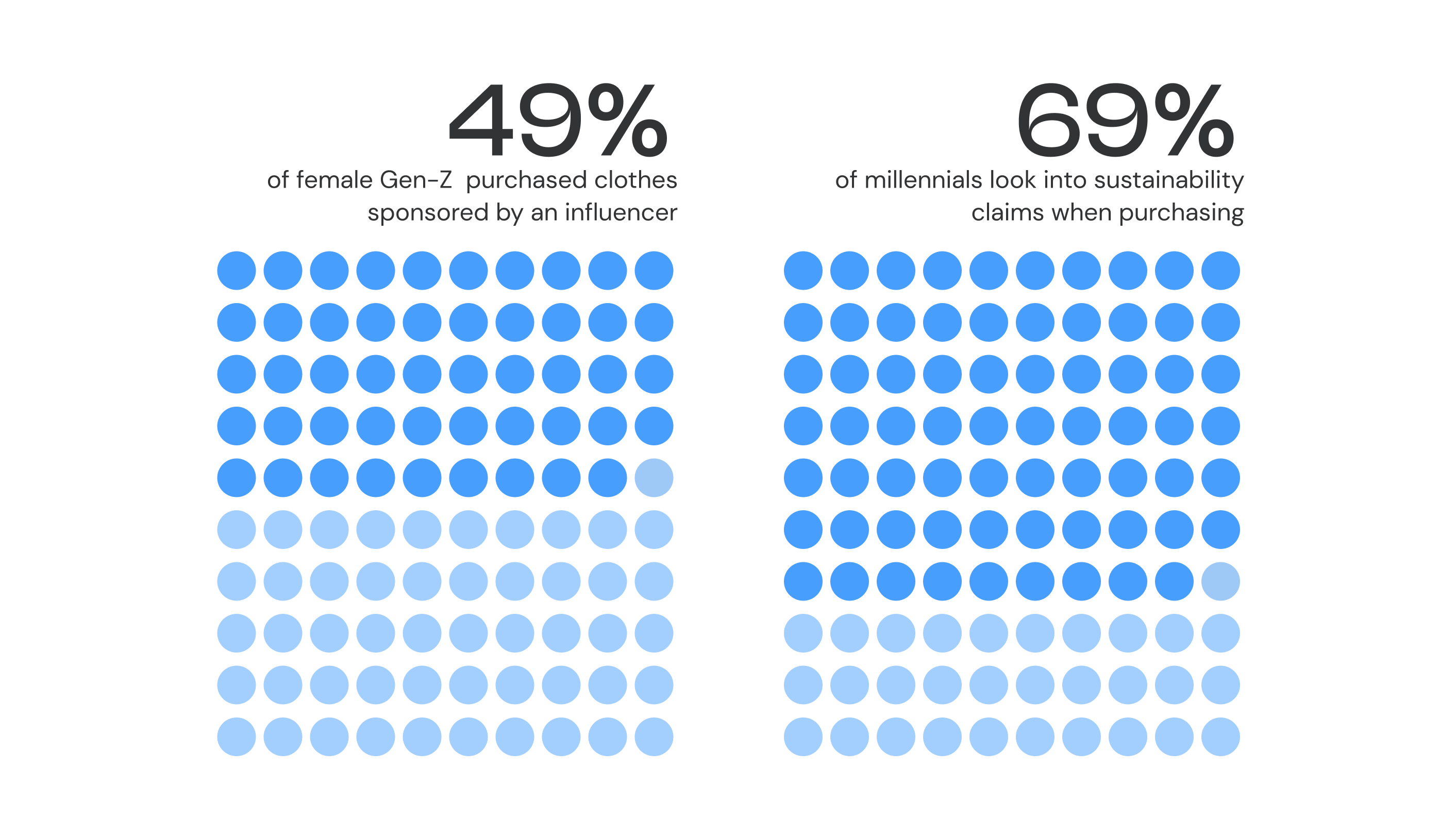
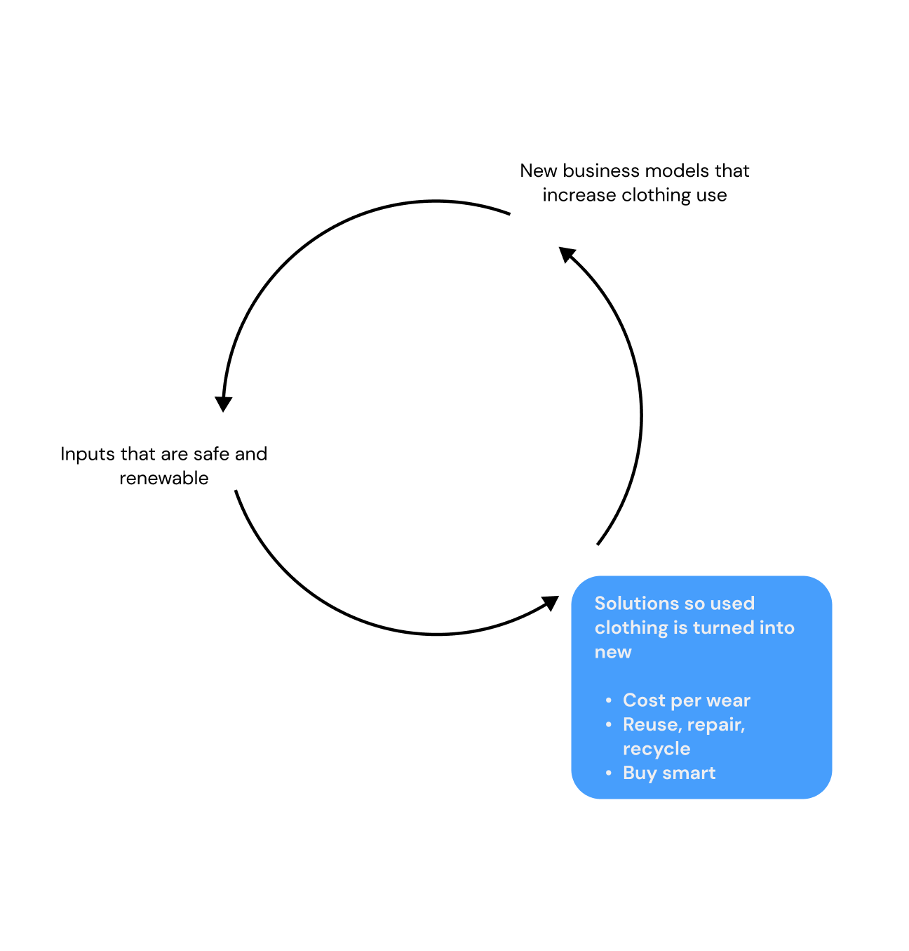
Through deeper exploration, I uncovered the influence of social media on consumer purchasing habits with several statistics that indicated consumer desires to purchase sustainably alonside statistics that showed behaviours that swayed otherwise. I also uncovered a rising phenomenon identified as circularity which can be defined as:
“Whereas sustainability mainly looks after the first stage of a product’s linear existence, circularity cares for its entire life cycle — from design and manufacture, to use, to re-use, to closing the loop with recycling or biological disposal.”
Through my network, I interviewed a total of 6 people. I used the desk research to help validate some of my assumptions. The interviewees and their purpose are listed as follows:
- Sustainability Analyst: Broader perspective on current sustainability practices
- Frequent Shoppers (4): Insight and behaviours of everyday consumers
- Fashion Influencer: Insights into the impact of their recommendations
Out of the interviews conducted, all participants indicated their care for the environment but described several pain points such as price, influence and difficulty identifying quality items thus deterring them from purchasing more sustainably. It also seemed to be a shared sentiment that trend influence played a huge part in their purchasing patterns and that they lacked knowlege of circular fashion solutions.
Key Findings
From the research, three key insights and opportunities were developed which informed the problem definition.
Define
The Problem
Informed by these insights, I embarked on refining potential solutions, recognizing the imperative of instigating genuine behavioral change and prioritizing education. It became evident that any proposed solution should avoid the acquisition of new clothing. This realization guided the formulation of my "how might we" question and subsequently informed the creation of the onliness statement.“How might we cultivate a circular economy, empowering consumers to embrace sustainable trends, prioritize quality, and enjoy a sense of style without missing out on the latest trends?
Ideation
During the ideation phase, the concept of creating a tracking app for closets, such as Echo, emerged as a promising solution. This idea stemmed from recognizing a gap in the market—users needed assistance in identifying materials, costs, and other relevant information about their clothing items. Understanding that users often seek convenience, it was imperative to design a solution that catered to their inherent laziness, making it effortless for them to engage with sustainable practices.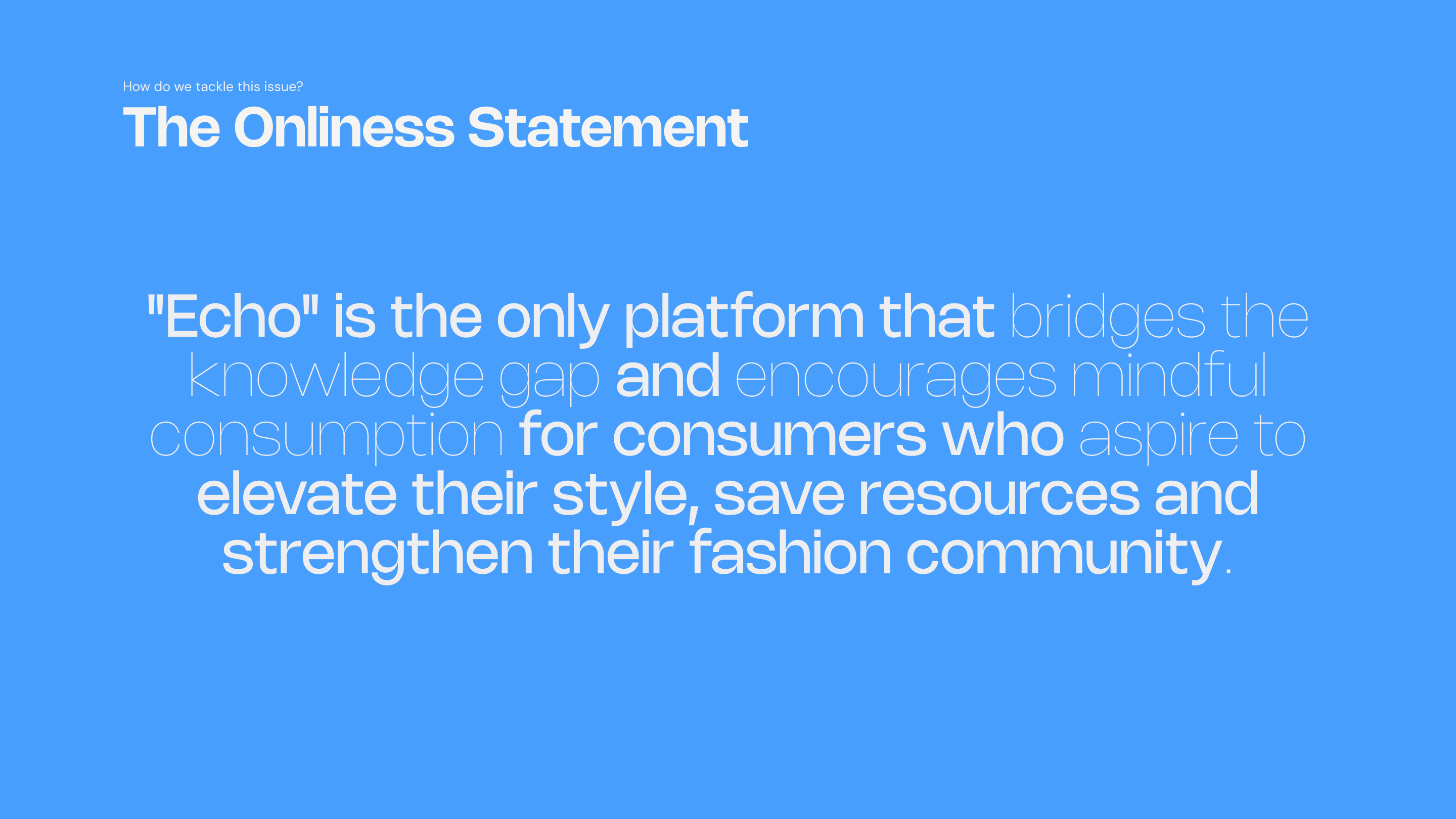
The Target
I developed a persona named Nina, a 22-year-old marketing professional from Toronto, ON, to illuminate the user journey and address key pain points. Nina embodies the ideal user—a fashion-forward individual seeking to document her style evolution while prioritizing quality and sustainability in her wardrobe choices. The app primarily targets women due to their heavy involvement in the fashion industry, yet remains inclusive of all genders, targeting individuals aged 18-29 frequently engaged on social media platforms. Leveraging insights from Nina's journey, I crafted features that resonate with user needs, informing the application's design and direction.
Ideate
Customer Journey
To better understand the main features of the application and visualize how a user (in this case, Nina) would utilize this in a realistic way, a user journey map was developed showcasing before, during and after phases of Echo usage.


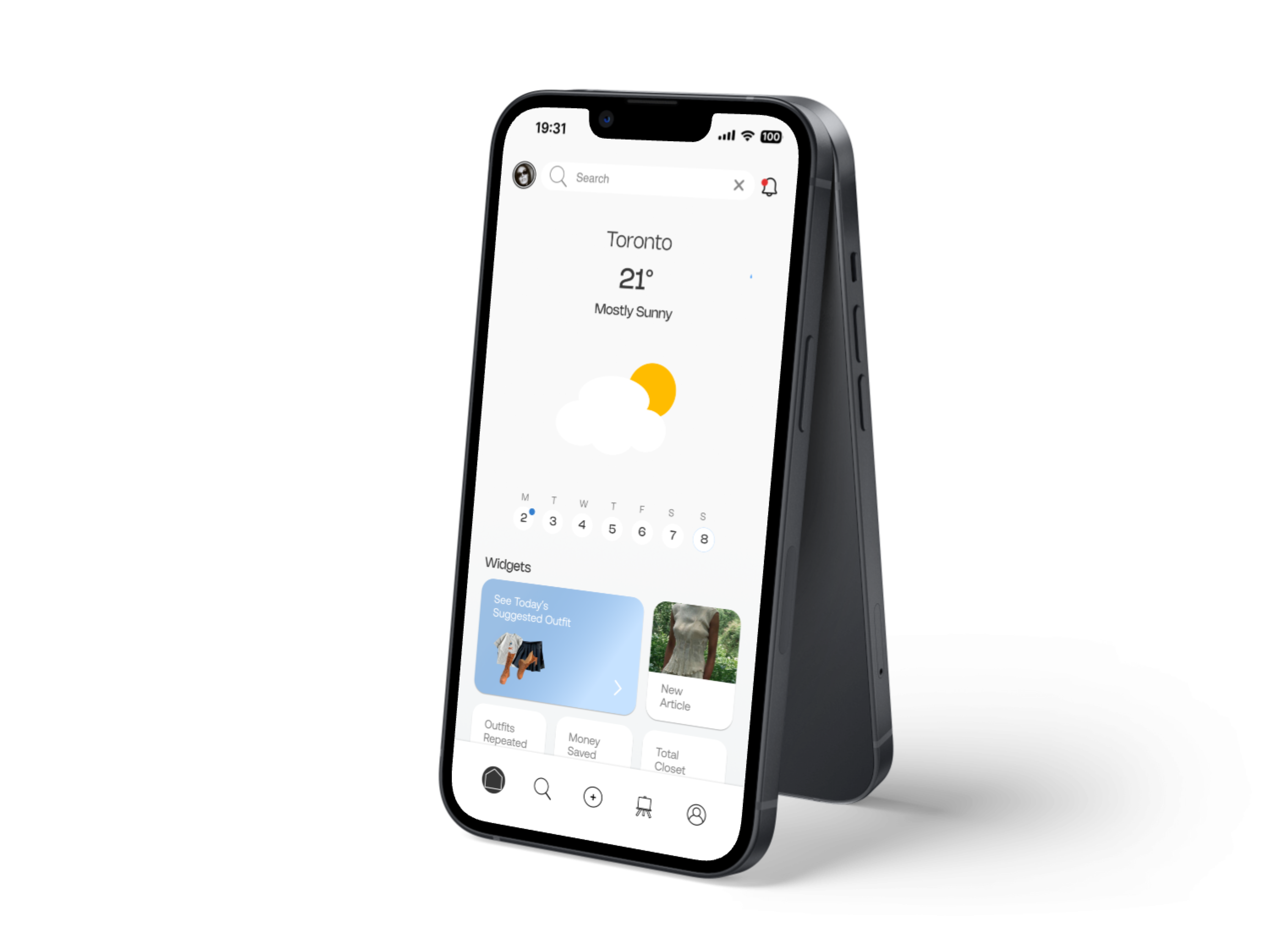
From here, I created an architecture map to map out the application and understand how things would interact with eachother. This map delineates how different sections of the application can be strategically arranged and accessed. The main page layout is structured into distinct sections, aligning with the information architecture framework. These sections correspond closely with the key stages outlined in the user journey. The main navigation bar features:
Home Feed: This is a dashboard that includes summarized insights of your wardrobe, a calendar to plan and track outfits, detailed weather forecast and AI outfit suggestions.
Discover: Explore insights and information on circular fashion principles including information on how to care properly for clothing to promote longevity.
Posting: Log your outfits and items and assess their sustainability, tracking details like cost per wear, materials, and brands.
Inspo: Explore diverse styles, search for specific wardrobe pieces, and ignite your creativity with a daily dose of fashion inspiration within the Echo community.
Profile: Access an archive of past outfits and a comprehensive inventory with detailed stats such as cost per wear.
Outfit Canvas Creation: Using the application’s existing feature to log clothing items, users would be able to visualize and plan outfits on a canvas, enhancing the app’s utility for daily ensemble preparation. This allows users to effortlessly experiment with outfit combinations and organize them into personalized folders. This feature not only amplifies the utility of the app for planning daily ensembles but also enhances the creative process of fashion exploration.

Name + User Interface
“Echo” embodies the spirit of circularity, echoing the essence of repetition and continuity in fashion. The name signifies a commitment to sustainability by emphasizing the importance of reusing, reimagining, and prolonging the life cycle of clothing items.For a sustainable fashion app like “Echo” that focuses on circularity, eco-consciousness, and reusability, a colour scheme that embodies these principles were ideal when constructing the solution. Since the universal colour for recycling is blue, the colour palette includes calming blues and lots of white space to indicate simplicity.
Echo is designed to resonate with a modern and younger audience, particularly women, who are keen on fashion and therefore typically enjoy visual aesthetics. Its design draws inspiration from contemporary graphic styles that embody elegance, sophistication, and simplicity.

The style guide had to be reworked throughout the process of creating the application but the following makes up the final style guide.
Wireframing, Testing + Iteration
In the initial stages of development, I explored the possibility of incorporating a social media aspect into the app. My assumption was that users might not feel motivated to document their items unless the app offered additional value through social interactions. Consequently, these assumptions influenced the direction of our wireframes. However, during preliminary concept testing, we discovered that this approach resulted in an overly complex app for its initial version. It became evident that we needed to streamline the app to better align with its core purpose.
Through interviews and user feedback, we uncovered a genuine interest among users in tracking their clothing items and collaborating on outfit planning. Users expressed enthusiasm for the idea of creating preplanned outfits using the items they logged in the app. Additionally, they found the tracking feature to be particularly valuable in gaining insights into their closets. These insights prompted us to pivot towards a simplified approach focused on empowering users to curate their wardrobe and plan outfits efficiently.
Later versions of the application also included more complicated user experiences and were later refined in the final stages through user testing and iteration. For example, tagging screens included several navigation paths and were modified to all be included on one page as shown below.
Before:

After:

Outcome
Introducing Echo: Your sustainable fashion companion. Echo goes beyond conventional fashion apps by serving as your outfit diary, sustainability tracker, and community hub. With Echo, you can effortlessly document your style journey, prioritize quality and sustainability, and connect with like-minded individuals. Revolutionize your approach to fashion and embrace mindful consumption with Echo.


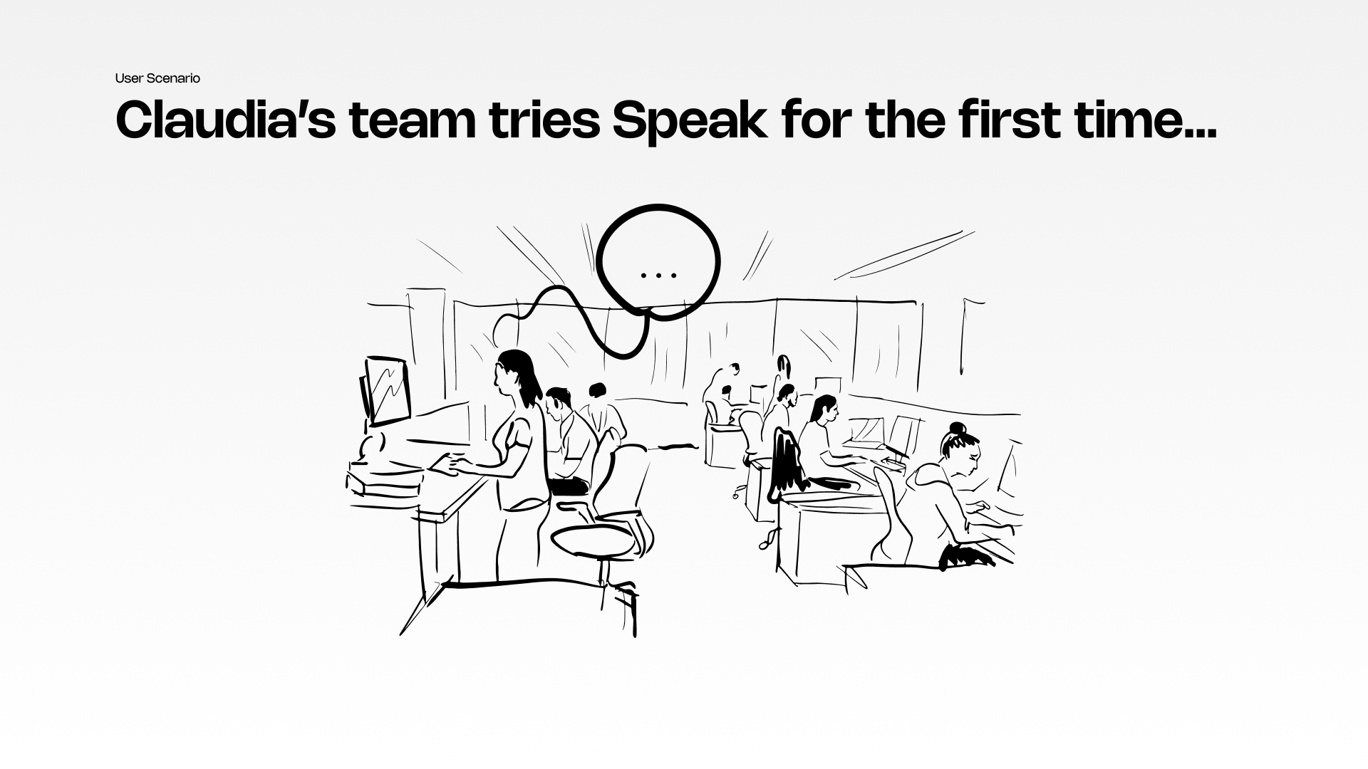
Speak
Intelligent Experiences in the Workplace: Longterm Engagement at Adidas
[In Collaboration with: Jean Tschanz Egger, Riccardo Sala + Samuele Brenna]Role: Researcher, UX Design, User Testing
Duration: 1.5 months

Abstract
In the contemporary workplace landscape, even with the introduction of engaging onboarding experiences and attractive perks, many companies face an ongoing challenge: sustaining long-term employee satisfaction and commitment. Despite the initial allure of these initiatives, employees often grapple with burnout and dissatisfaction, significantly impacting productivity and overall morale. Addressing these challenges necessitates a comprehensive exploration of the root causes behind employee disengagement and unhappiness.


The Challenge
As part of our project scope, Adidas assigned us with the critical task of investigating the root causes of employee turnover and devising strategies to improve long-term retention. More specifically, we were given the following questions to answer:
“How can we design a future intelligent experience allowing employees to remain engaged, motivated and committed while running their daily tasks?“
“How could this experience promote knowledge sharing across different departments generating value for the company as a whole?”
Research
Learning Objectives
To effectively tackle the challenge, we established the following learning objectives to guide our research and design process. These objectives helped us focus our efforts and streamline our scope:
Structuring the Research Plan: Methodology
We continued to structure our research plan by establishing mandatory and nice-to-have criteria for recruiting our interview participants. We aimed to gather a diverse range of perspectives by including employees at different stages of their careers and from various generational cohorts. Specifically, we sought to interview:- Employees entering, existing, and exiting the workplace (years of experience)
- A mix of Millennials and Gen Z employees
We also created an interview plan and script. Our interviews were held by myself and a colleague. I interviewed the user while my colleague recorded important answers. All interviews were also audio recorded with the permission of our interviewees. After each interview we debriefed and revised the questions as needed.
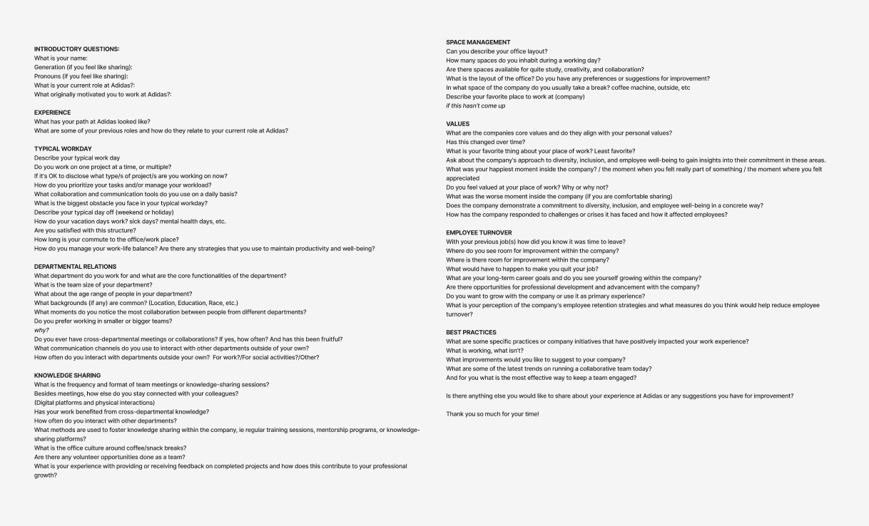
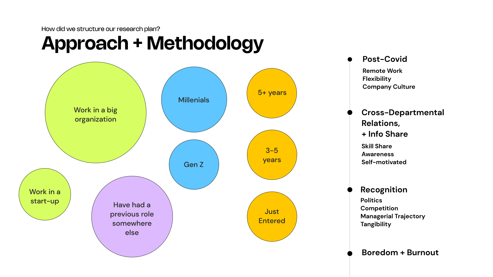
In our interviews we mostly came across those working at big organizations. The most prevalent topics that came up included:
- Post covid including the status of remote work, flexibility and company culture
- Cross-Departmental Relations + Info Share
- Recognition including politics, competitions, managerial trajectory and tangibility; and
- Boredom + Burnout
Insights + Opportunities
From the research, two key insights and opportunities were developed which informed the problem definition.
The Archetypes
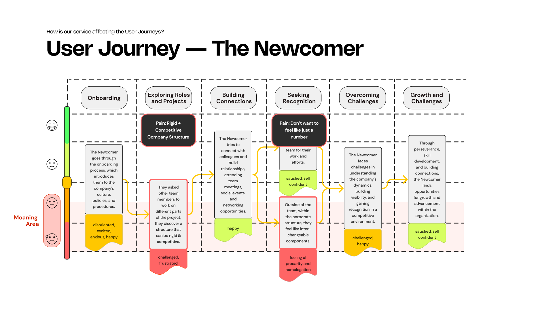
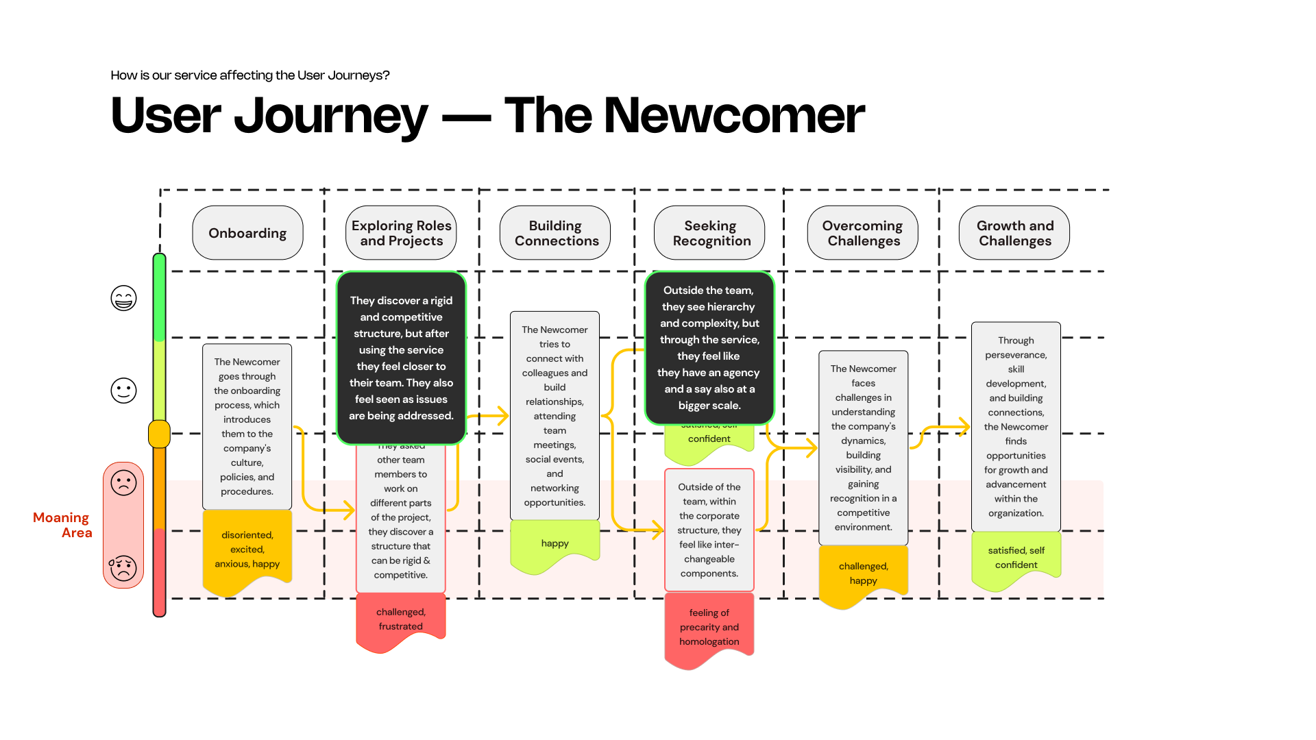
In order to better categorize and understand our insights, we created archetypes.The archetypes included “The Newcomer” employee; This is somebody who has just entered the workforce, excited to prove themselves and take on the world and don’t want to feel like a number.
“The Been Around the Block” refers to an intermediate position who has masted their craft and craves more community.
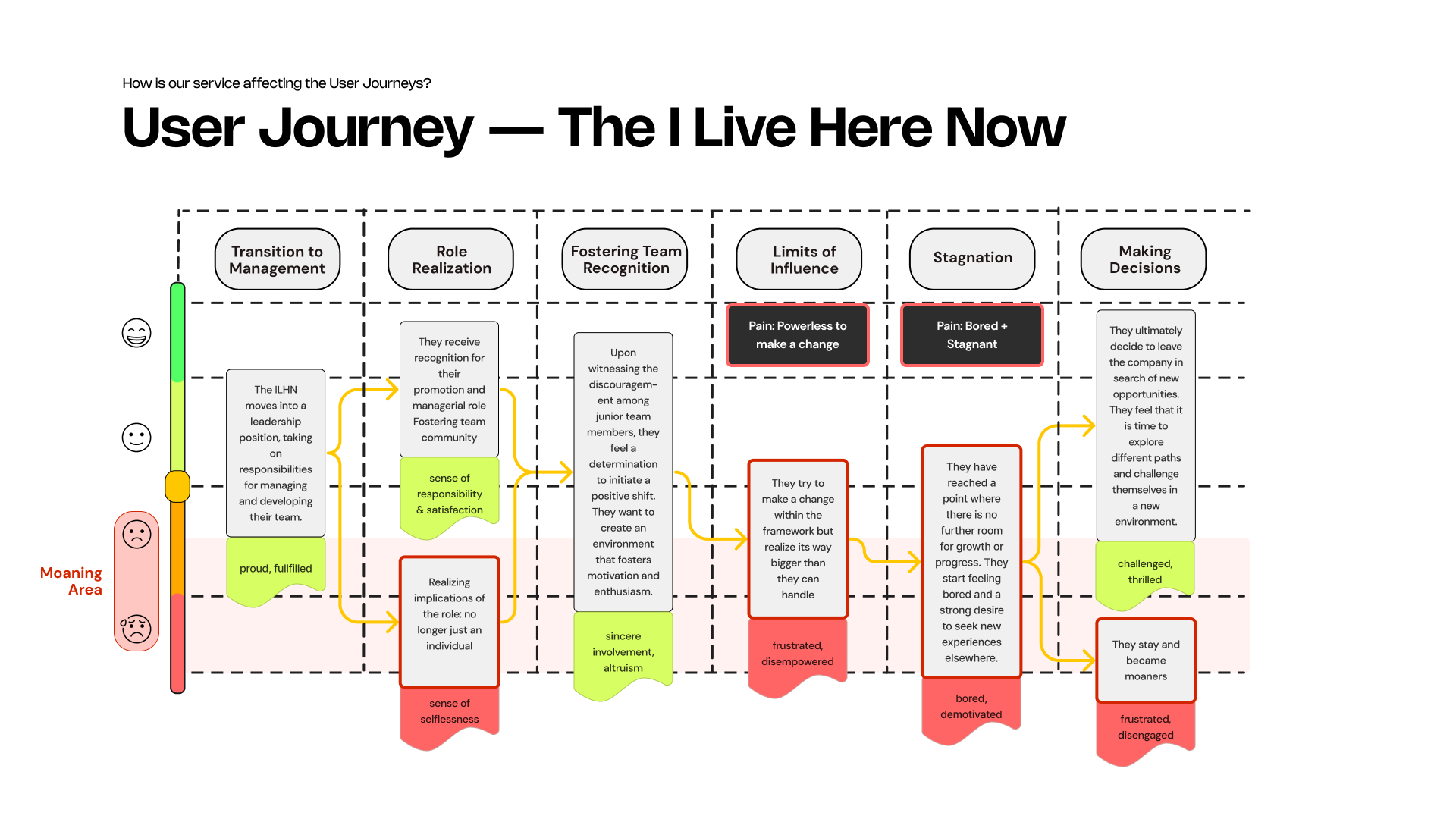
Lastly, “The I Live Here Now” is an employee that displays leadership skills, has worked in the industry for quite a while and typically fits a managerial role. This particular person usually doesn’t have much more room for growth and can often feel bored and unfulfilled.

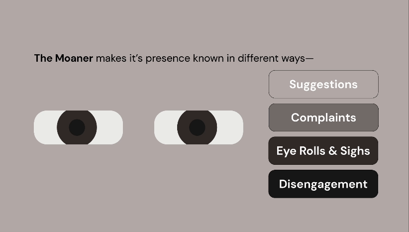
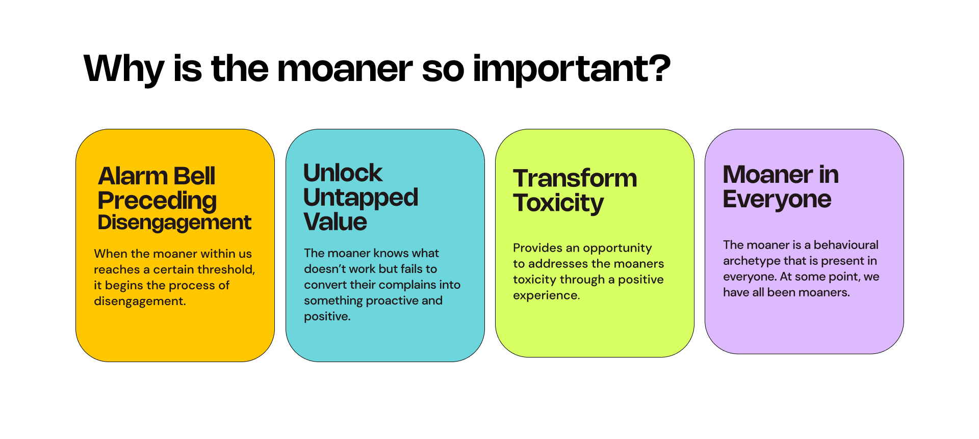
Interestingly enough, within all these roles we discovered a common trait that we’d like to distinguish as “The Moaner”.
Now what is “The Moaner” you ask? The Moaner makes it’s presence known in different ways—often first with suggestions during meetings, when these aren’t heard, it may complain during coffee breaks, with other co-workers, or at the water cooler, over time it may manifest itself in eye rolls and long sighs, before manifesting into it’s final form: disengagement.
Define
With this additional insight of the moaner... the new question to be asked became:
“How do we free the moaner!!?”

The Idea
Speak is a service that enables a decentralized and community-based feedback cycle, where employees can collaborate, learn, and envision improved scenarios for their workplaces.Speak is for progressive middle managers who want to experiment with a new form of engagement and decentralized feedback cycle within their team and for employees who want to collaborate, learn, and envision improved scenarios for their workplaces.
We essentailly wanted to take the need for agency and updated appreciation frameworks and give these people a space to moan, thus providing employees with a sense of voice, community and a way in which they can improve their place of work, thus avoiding disengagement.
User Journeys
To better understand each of the archetypes, their moaning phases and how the service would affect them, we created a user journey for each archetype.The Newcomer
The Been Around the Block


The I Live Here Now

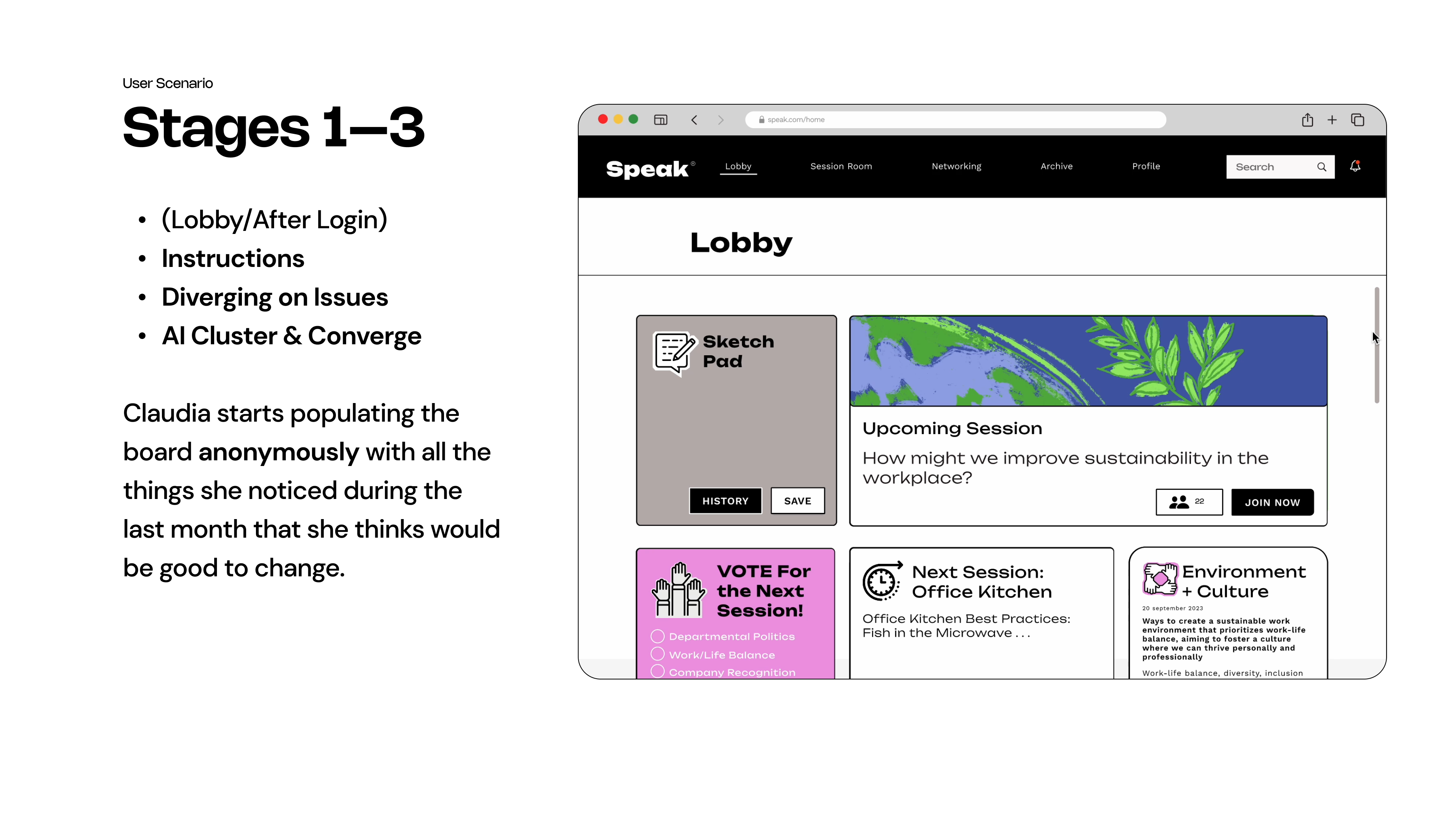
Service Blueprint + Information Architecture

So... How does it work?
The online service is made up of two main experiences coordinated by a dedicated desktop and followed by the production of a report.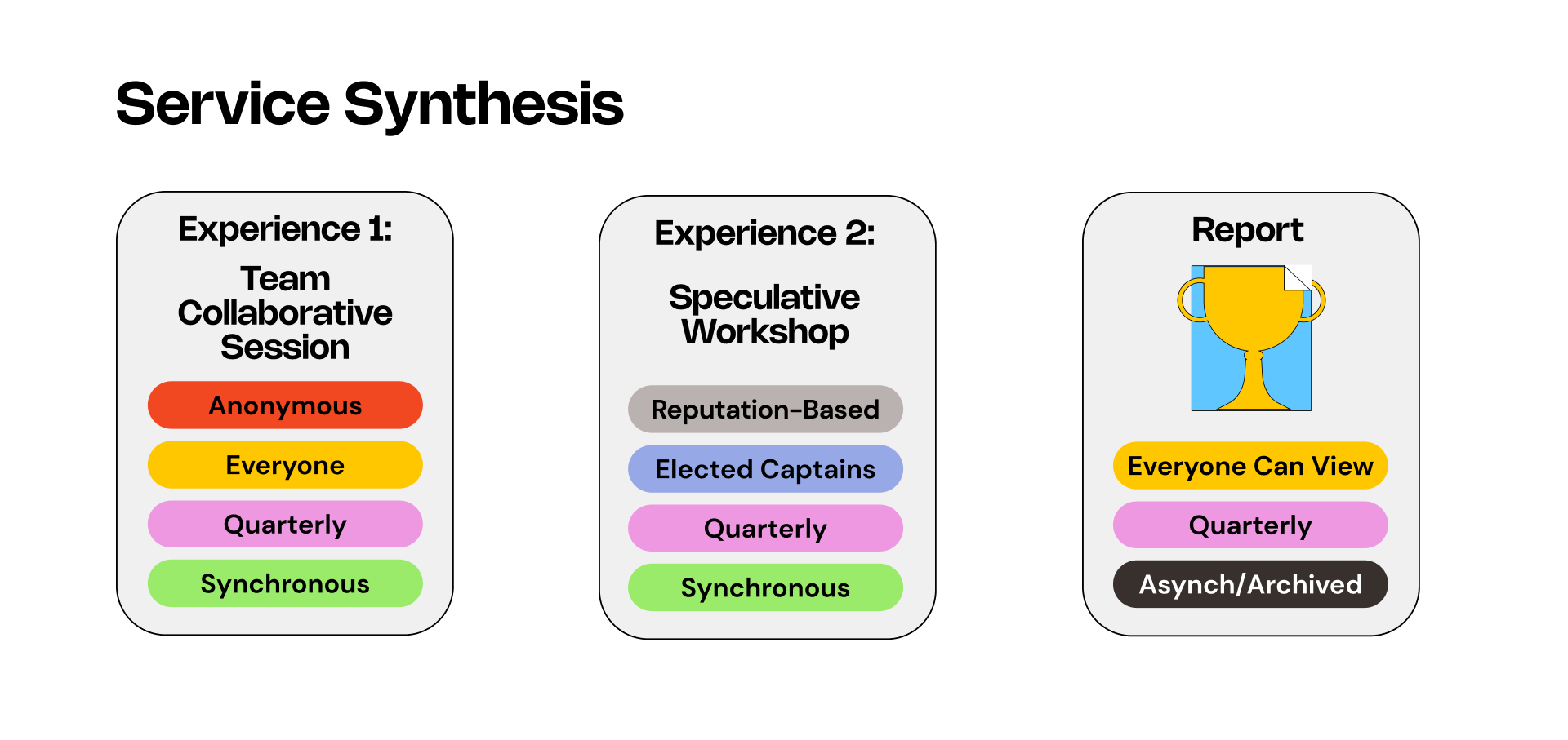
Experience 1: Team Collaborative Session
In the Experience 1 every team use the platform in the same moment to define problems and challenges. They can:- Input topics
- Cluster topics
- Rank topics
- Vote a Captain
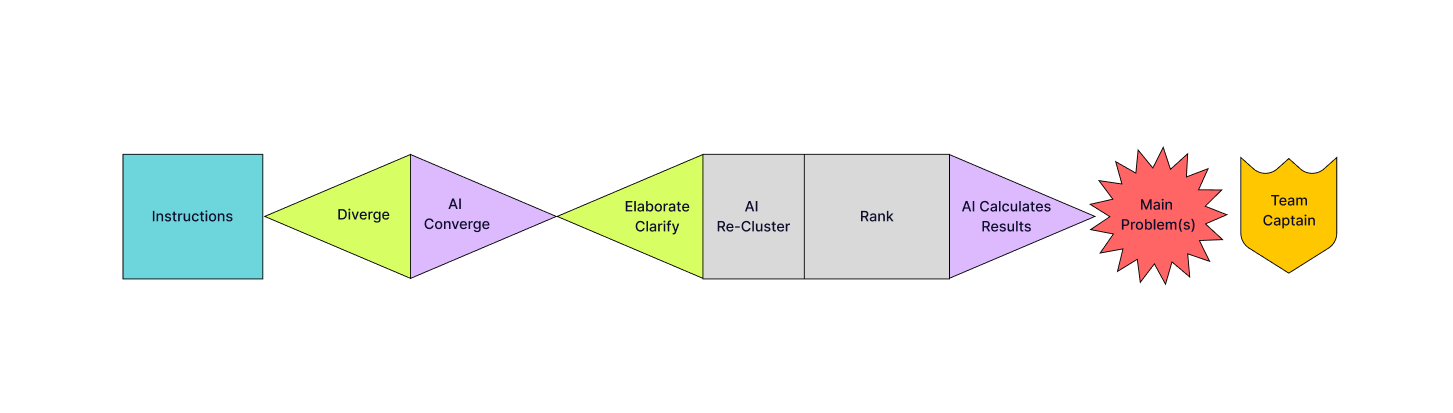
Experience 2: Inter-Departmental Speculative Workshops
The elected Captain will go to the Experience 2 to further the conversation around the most relevant topics. They would use the platform and a special conceptual map to:
- Speculate
- Ideate together
- Actionable solutions
- Generate a report

Part 3: Report Generation
The report will then be accessible to everyone within the company and will become part of an archive. This report is meant to be temperature check or speculation for the entire company.
The process is not top-down, no longer bottom-up, it is DECENTRALIZED.
The Focus
For the first phase of this project, we focused on Experience 1: Team Collaborative Session. We developed a storyboarding exercise to better explain how the collaborative team session works. You can check it out here.


Check out the Mock-Up ︎︎︎
User Testing
The team interviewed 6 users for a total of 6 hours. A combination of paper prototypes, digital prototypes and concept testing was used to achieve our results. The results were as follows: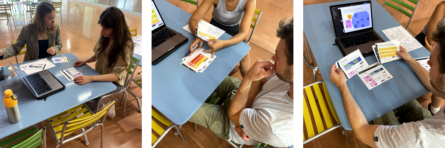
Next Steps
- Beyond nominating team captains, the framework would be expanded to include a guild to help the team captain tackle the chosen topic.

- To better identify skill share and captain nominations, profiles will be created with preferences, skills and past sessions history.
- More Testing within a “real” environment to gather feedback on the whole process
Flo + UTI Expansion
[In Collaboration with: Angela Landi, Jack Laven]Role: UX/UI Designer, Conversational Designer, Researcher
Abstract
Urinary Tract Infections (UTIs) are a common problem for young women which can be both painful and frustrating. Surprisingly, many of these women lack knowledge on effectively treating UTIs. To help address this issue, we expanded the functionality of Flo, an app designed to assist women during their periods. Now, Flo encompasses comprehensive UTI information, tracking features, and educational resources, empowering young girls to proactively manage and prevent UTIs. Moreover, we have introduced a digital assistant within Flo, offering users prompt and accurate responses to any health-related inquiries they may have.

The Challenge
As part of the project brief, we were tasked with creating a digital assistant that could help educate users on intimate care, with a focus on UTIs (Urinary Tract Infection Diseases), their prevention and treatment and Antimicrobial Resistance (AMR). Our reserach aimed to address one question: “How can digital assistance improve our literacy of well-being and intimate care at home?”
Research
Desk + User Research
With our brief in mind, we began reviewing several resources to better understand the issues of Urinary Tract Infections (UTIs) and where there was potential for developing better health literacy.We then started to conduct some initial 1:1 interviews, focusing on women who had suffered from chronic UTIs and a microbiologist expert. In these interviews, we quickly shaped our topic of interest around prevention of UTIs. Specifically, we looked into alternatives for antibiotics and any other proactive or preventative methods that could be used. We quickly discovered however, that although probiotics and home remedies helped some patients, there was little research that supported their claim. From here, we needed to restructure our research— with the lack of alternative remedies, the best way we could prevent and better teach intimate care regarding UTIs was through education.
We conducted another round of desk research and interviewed 13 more women focusing on those who have experienced frequent UTIs and similar conditions, young women (aged 18-24) who have had one or less UTIs in their lifetime and healthcare professionals.

Key Findings
From our research, we developed three key insights and opportunities to help develop the problem definition. The common themes, in the insights, were awareness, research and prevention.


Define
The Problem
Young women need a way to become informed about preventing, identifying, and effectively treating UTIs before they could become a problem for them. Equally important is instilling a sense of confidence in their knowlege and abilities to manage UTIs. This led us to the reframing of our “How Might We” question.“How might we better teach intimate care in young women to better treat UTIs and manage the threat of antibiotic over-usage?“
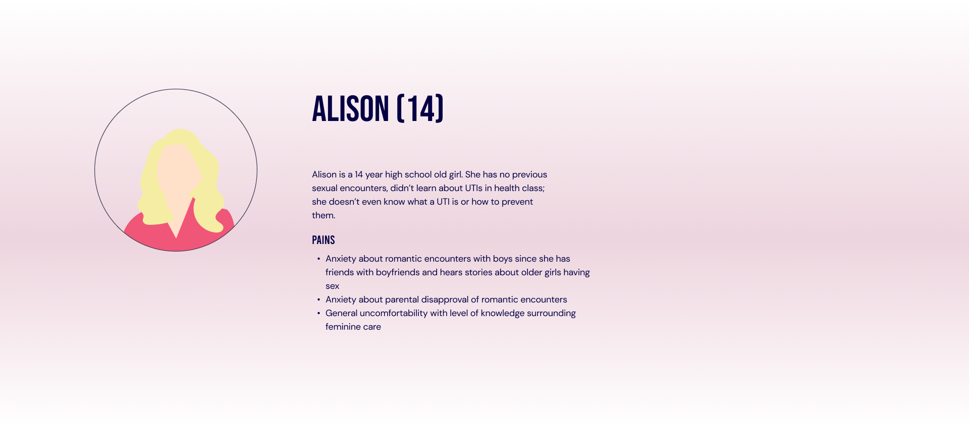
The Target
While we would like the UTI expansion to be usable by all women, just as the base app is, we wanted to target young women in order to break the UTI loop early before it leads to chronic UTIs and over-use of antibiotics. Young women are already in the mode of learning about feminine health and are likely to be receptive to new tools and information about UTIs. Additionally, women aged 18-24 are most effected once sexually active and educating them before they get to that stage could help prevent any problems that could arise in their future.To gain deeper insights into our target audience, we diligently conducted interviews at every stage of the process, including in our ideation, user testing, and branding to ensure their perspectives and needs were at the core of our decision-making.
Ideate
The Ideation
According to Avily & Levis, “Health apps have often been conceptualized as revolutionary tools for patient empowerment and education (2019).” And in an age of digital devices, what better way to educate Gen Z than through a health application.In our ideation we found that creating an application unique to UTIs could be too niche, and from our initial research we discovered that our demographic preferred the information be embedded into their existing routines and classes. We therefore developed a UTI expansion app that would be embedded into an existing period app— an app widely used by young women to track their periods and daily symptoms.
To begin this, we started with some market research and identified some applications that we thought had potential. We initially identified six applications and rated their positives and negatives.
Benchmarking

We chose the app Flo as it showed the greatest potential for incorporating the features we wanted to fit in. We then conducted an analysis of must-haves, could-haves, should-haves and won’t haves for the application going forward.
![]()
From the analysis we dissected the opportunities of focus including:
To develop a better idea of what our target is captivated by we did some additional desk research and then created a mood-board with that information.
Some key desk research we found was:

From the analysis we dissected the opportunities of focus including:
- Creating a voice assisted animated character to give more personality to the application and to help assist the user in their problems
- Added UTI Features including sections dedicated to UTIs, games and articles to better appeal to our target.
- A free feature of the app for women under 18 to help promote health literacy.
- UTI Doctor’s Reports within the insights to help women better track their symptoms and infections and easily share with doctors.
- Added UTI Symptoms within the existing symptom tracking to put into the Doctors Reports.
Customer Journey
To better understand how our user could acquire and use the new extension pack, we developed a user journey map to better understand their experiences. These consisted of three different phases; the before, during and after which walked through Alison’s activities and emotional experiences.Validate
Visual Identity + Character Development
To develop a better idea of what our target is captivated by we did some additional desk research and then created a mood-board with that information.
Some key desk research we found was:
- Gen Z does not like distinctions like blue for boys and pinks for girls;
- Gen Z enjoys trend-led identity packs with a flexible palette of icons and colors to reflect ‘trends.’
- 2-3 colors is more than enough and make sure that content is visible.
- 3-D images and inclusive images is popular amongst Gen Z.
User Interface
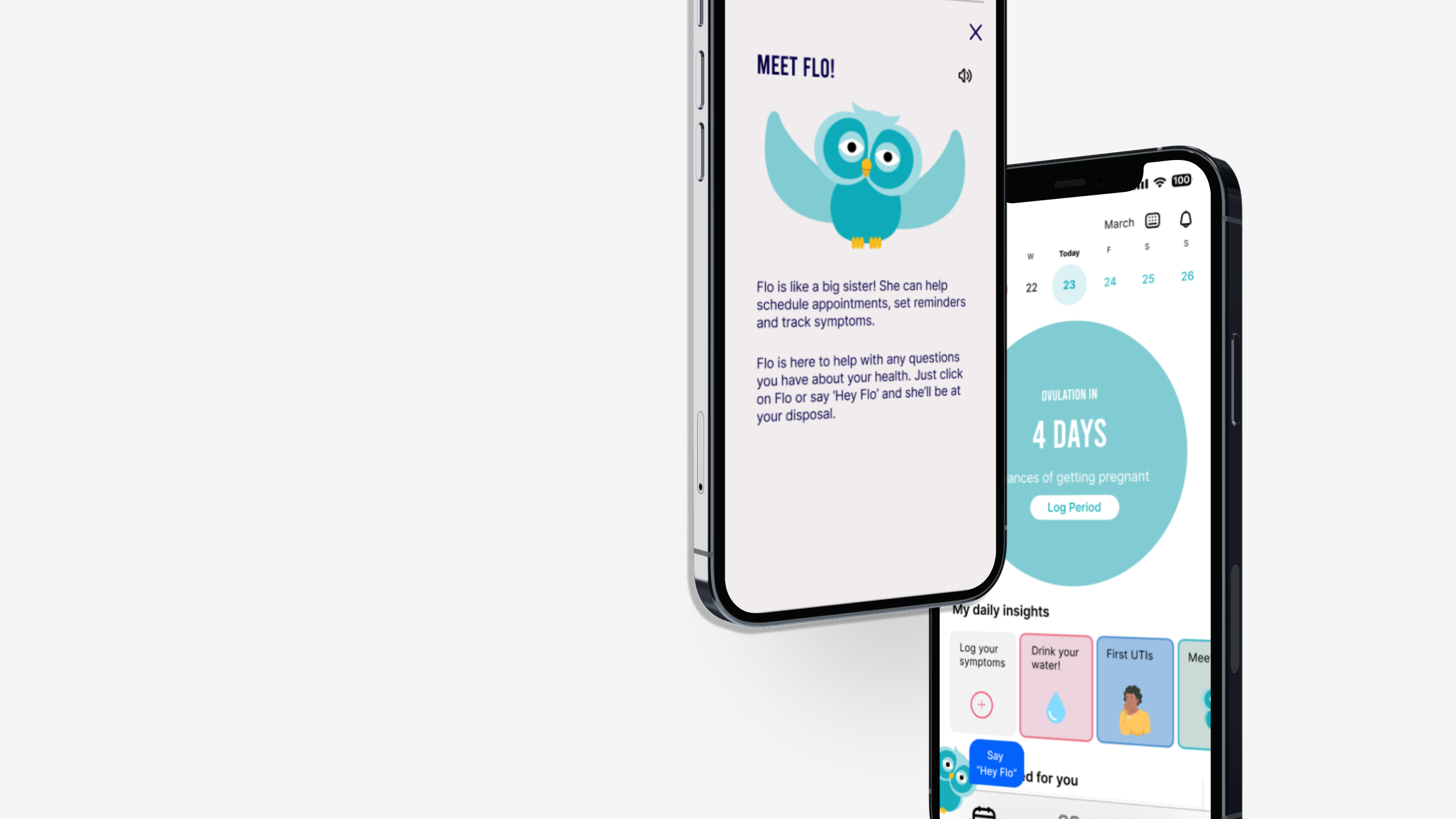
From there we began to develop the branding of the UTI Expansion. The new colour palette consisted of bright and vivid colours associated with Gen Z— our target audience. Specifically, we added two bright blues and a funky patterns to appeal more to our demographic as the existing application was quite plain and lackluster. The blues and funky patterns are found within the app in sections where the new UTI features are included.For the font, we chose Inter because it is the one used by the existing app and we did not want to destabilize the user. We additionally added Bebas, a more contemporary font to help distinguish the new UTI feature.

We then developed the personality and look of our voice assistant that would be incorporated into the app, an owl named Flo. Flo was developed in Adobe Character Animator to better show her expressions and give the same expression of speaking to our user. We created four main states as shown above, each representing a different action. An owl was chosen as they are an animal characterized by wisdom and the original logo of the Flo app is a feather. After some interviews, and to accommodate to Gen Z preferences, we steered away from pink for her appearance. As a big sister, her personality is helpful but a little sassy in nature which was reflected in her natural dialogue.
Wireframing
After the branding and functionalities were determined, we began low-fidelity wireframing on existing screens and new screens using Figma. We additionally began prototyping conversations through Protopie.Onboarding
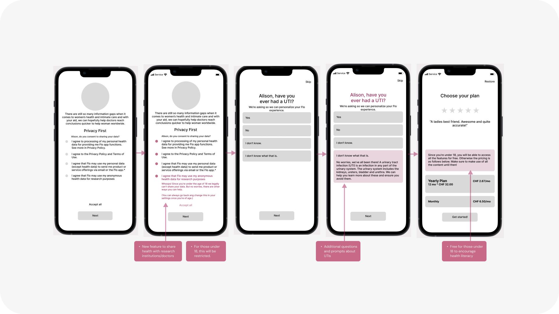
Virtual Assistant + Content

Health Reports, Stats + Test Results

Test
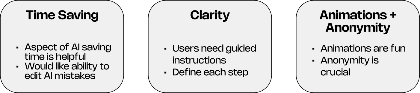
User testing for the voice assistant was composed of two stages: Lo-Fi Wizard of Oz testing and a Hi-Fi prototype using ProtoPie.
Lo-Fi Wizard of Oz
Before developing a working prototype we decided to use the Wizard of Oz test method to get feedback on our concept and voice flows of the voice assistant. Voice flows were tested by mapping our potential conversational flows This was refined throughout the user testing.
Signal is a chat service that had a similar interface to our mockup of the chat the user would have with Flo, so we used that for the messages and a WhatsApp phone call in the background to mimic the voice. We also used text-to-speech for the VA’s voice in order to better approximate its speech patterns.
However, because of this large pipeline of software working in tandem, the responses came with a large delay that affected the ability to use the model to test what we wanted as the users were more concentrated on the functionality of the VA than its personality.
However, because of this large pipeline of software working in tandem, the responses came with a large delay that affected the ability to use the model to test what we wanted as the users were more concentrated on the functionality of the VA than its personality.
Hi-Fi Testing
For the Hi-Fi prototype we used ProtoPie to give the interface a much more similar design to the mockup we had envisioned. It also had speech recognition paired with many responses to possible utterances which could be voiced and shown automatically by ProtoPie in response to user prompts/questions.
Outcome
Flo + UTI Expansion is the ultimate app for period tracking and intimate care. The comprehensive platform now goes beyond the norm by providing thorough UTI tracking, credible resources, and voice-activated assistance to help advise proper treatment and prevention of UTIs. With Flo + UTI Expansion, you have the power to take control of your health and well-being like never before.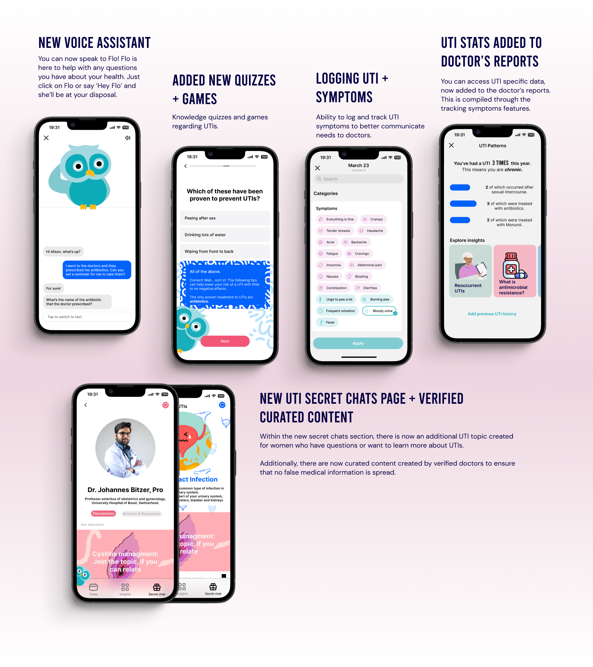
Check out the full project here ︎︎︎